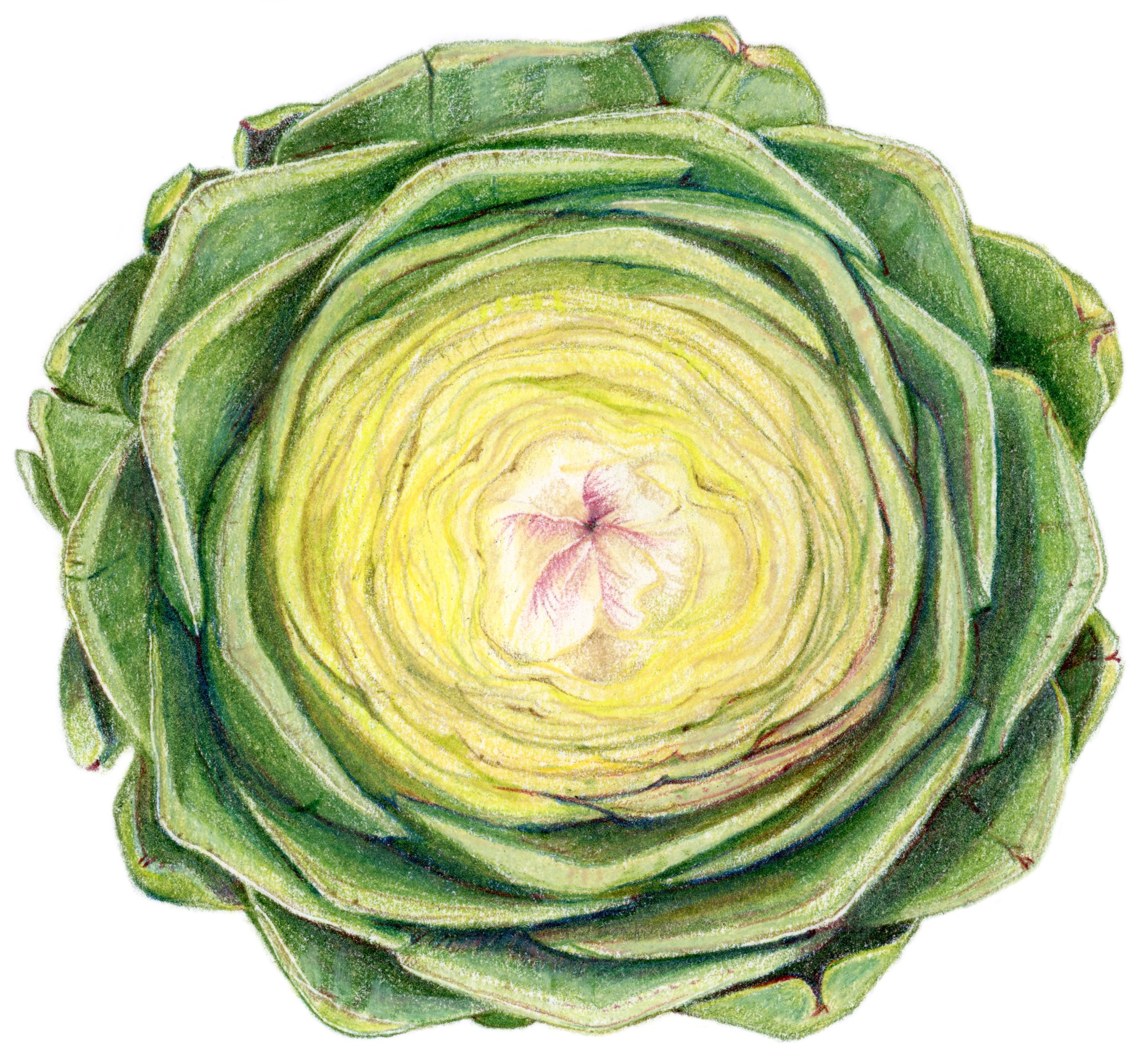
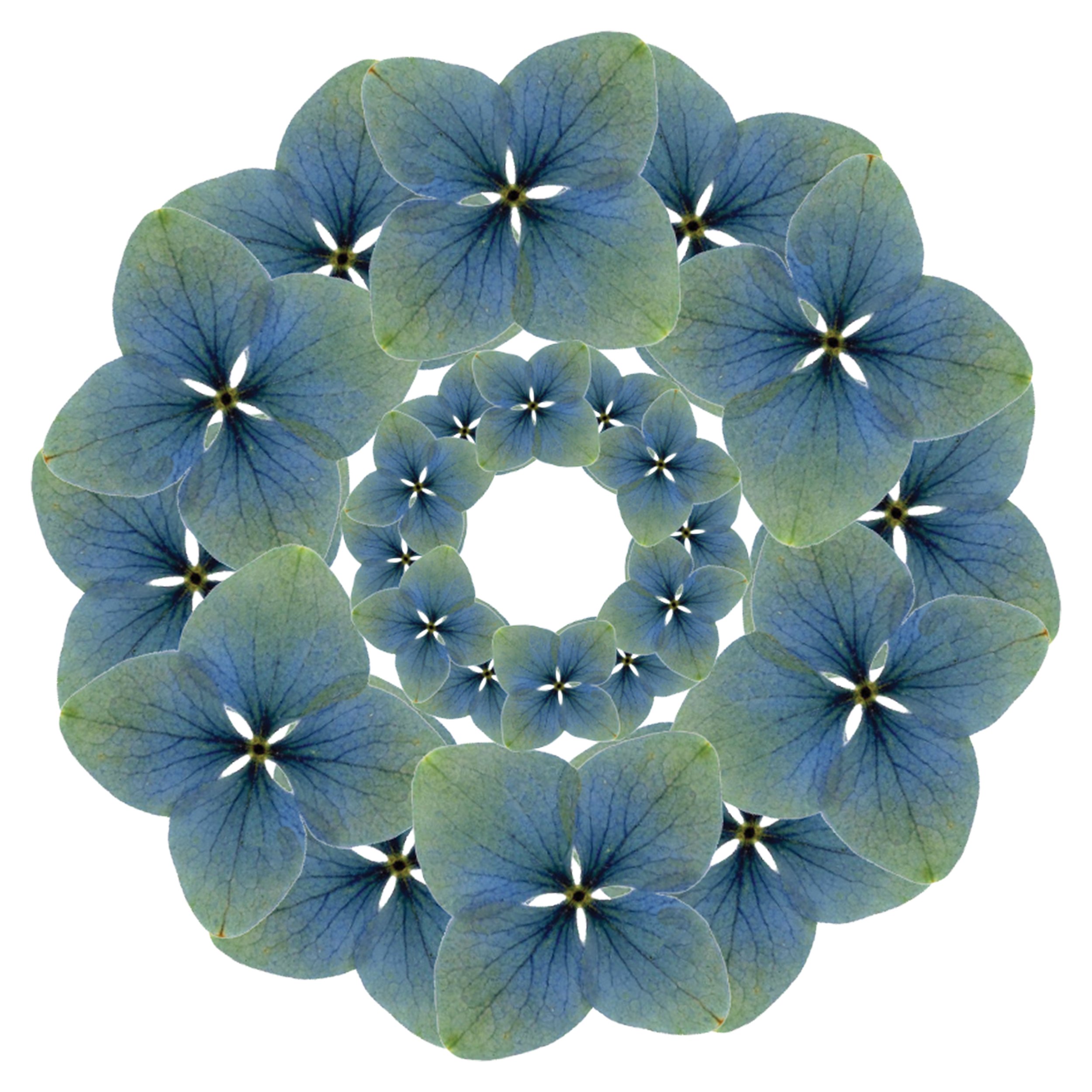
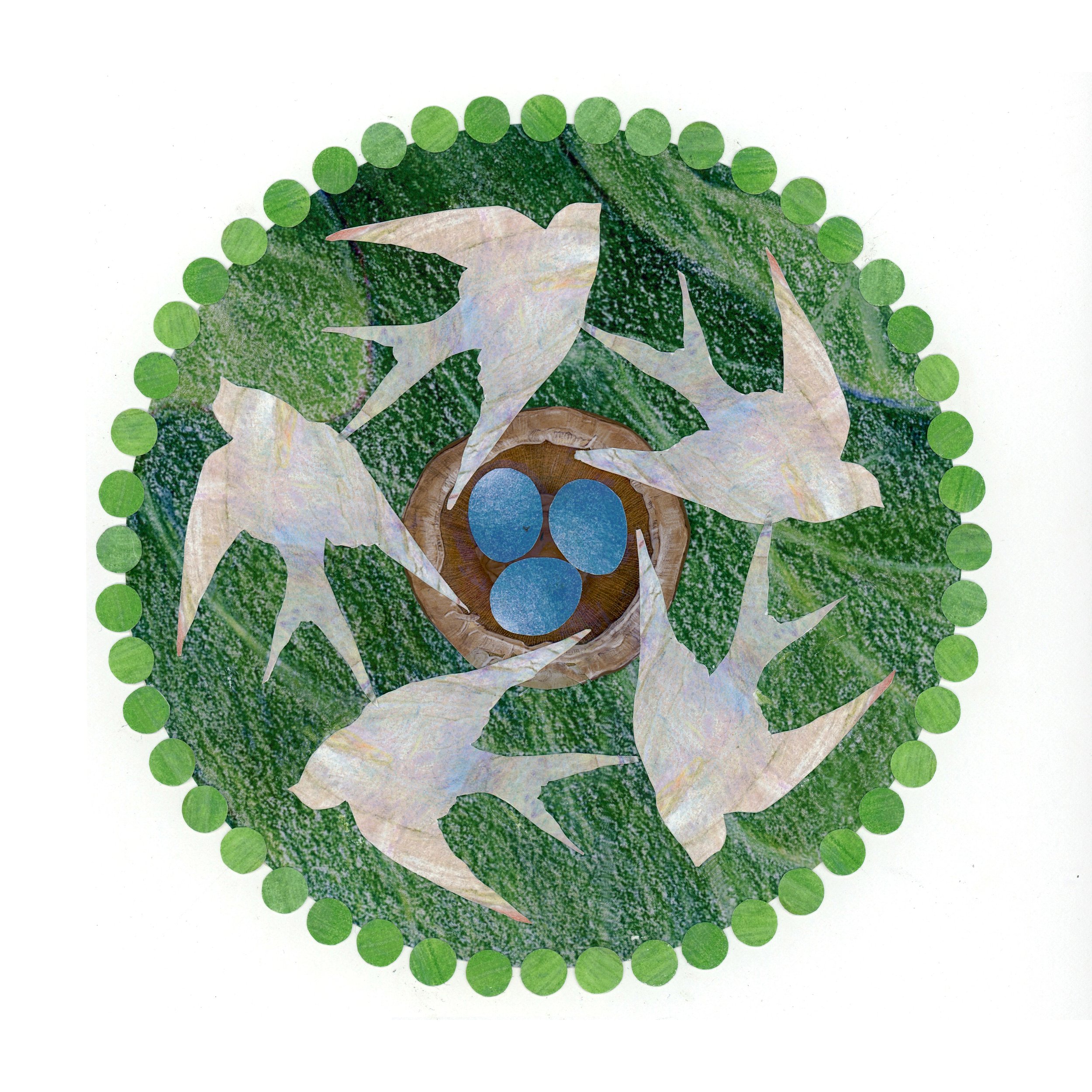
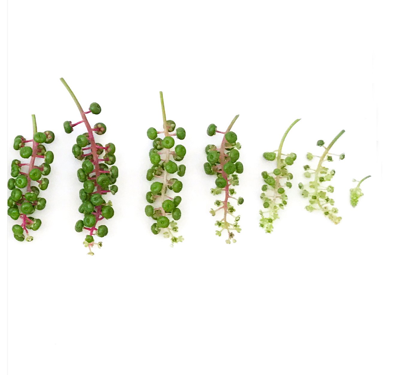
Much of my artwork is inspired by structures found in the natural world.
I enjoy exploring nature’s patterns as well as the visual overlaps
that often occur between nature and our man-made world.
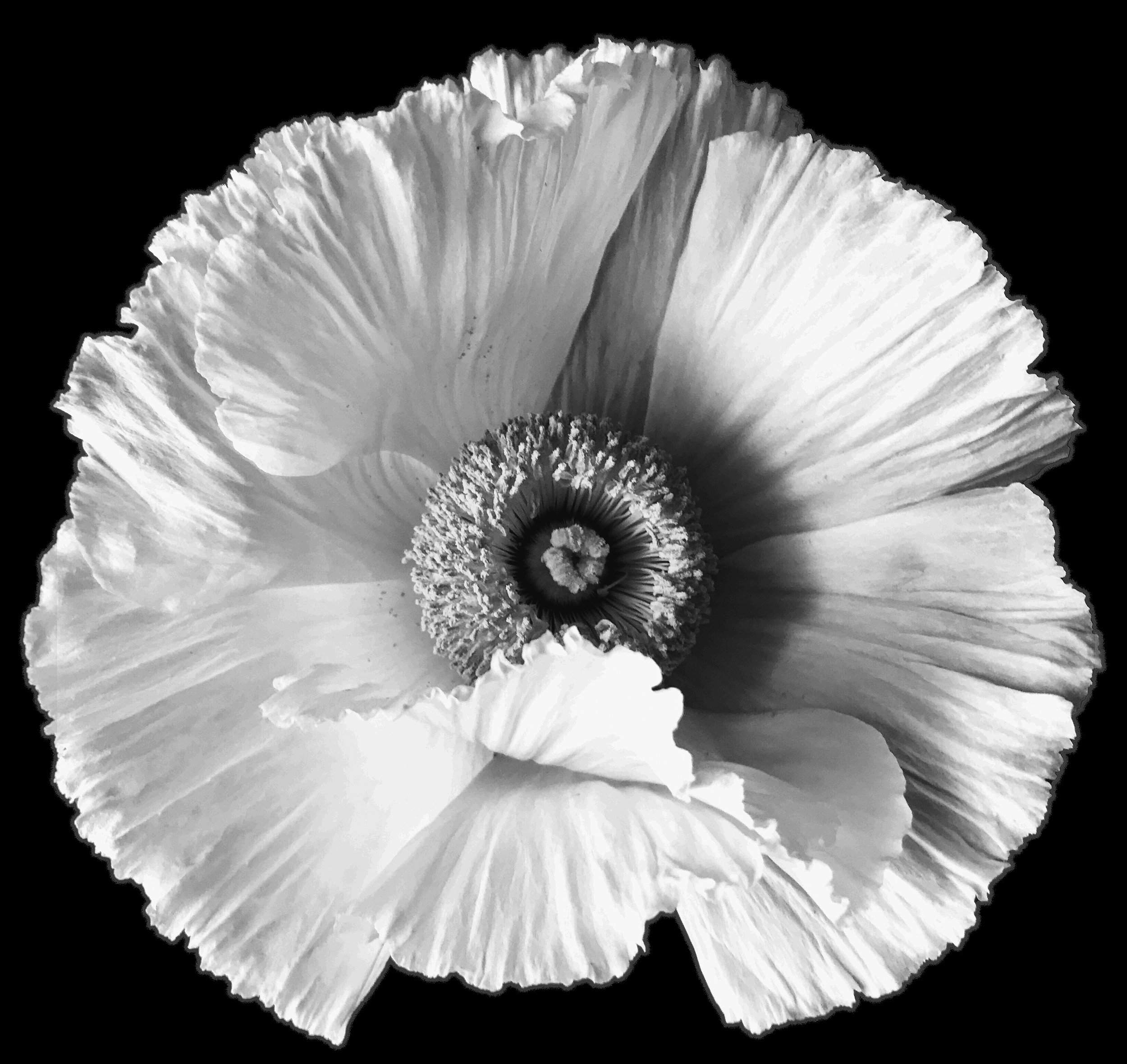
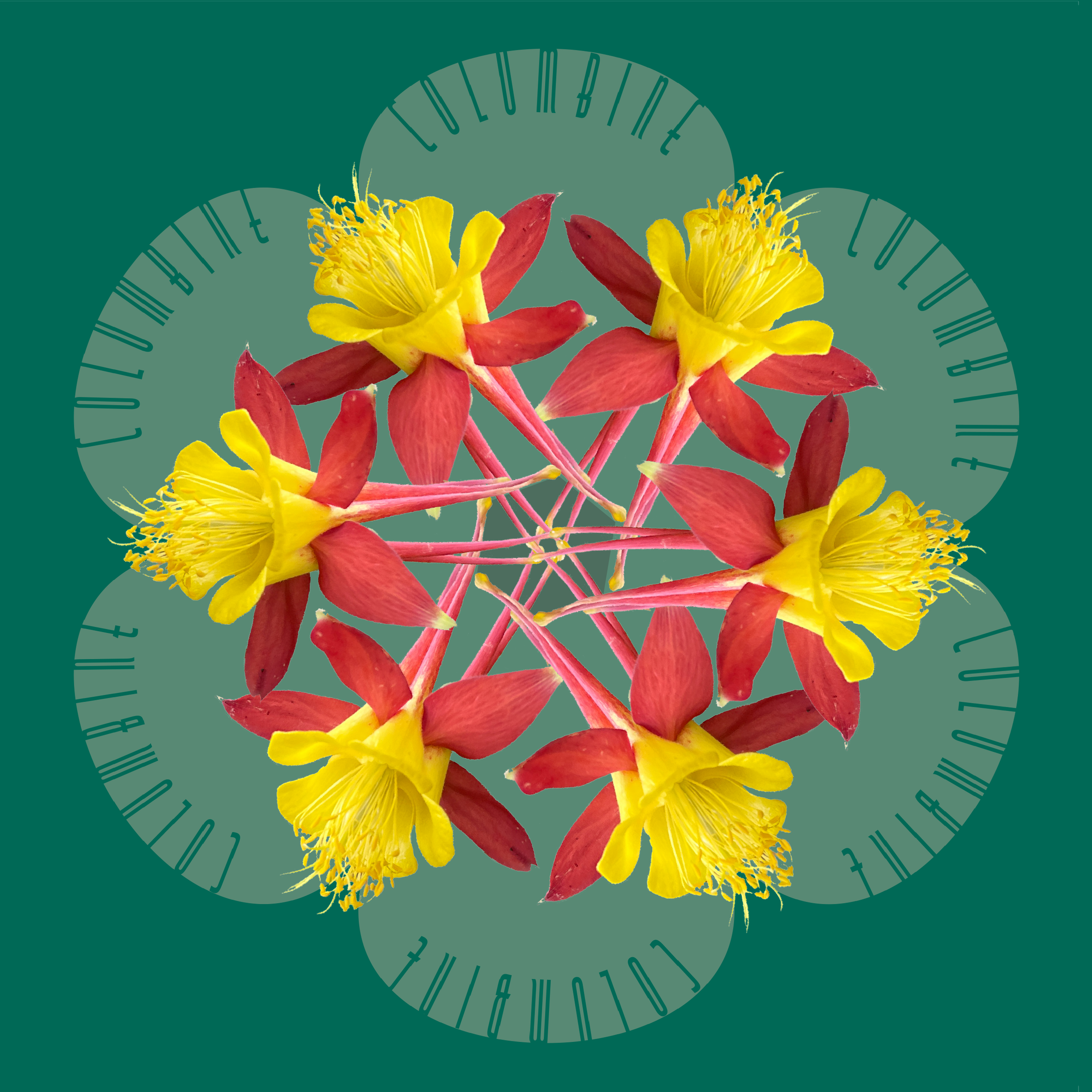
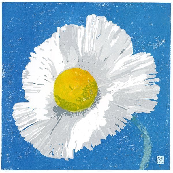

Much of my artwork is inspired by structures found in the natural world.
I enjoy exploring nature’s patterns as well as the visual overlaps
that often occur between nature and our man-made world.